
GRAINGER LEGAL BALLARAT PROJECT DESCRIPTION
Grainger Legal is a boutique, personal injury law firm servicing regional Victoria. The partners at Grainger Legal engaged our team to help bring their vision to life through the development initially of a logo and associated branding. This naturally led to the development of a results driven website for the firm.
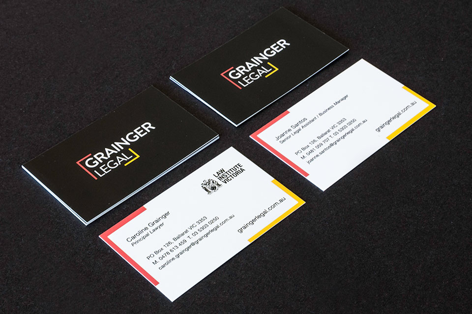
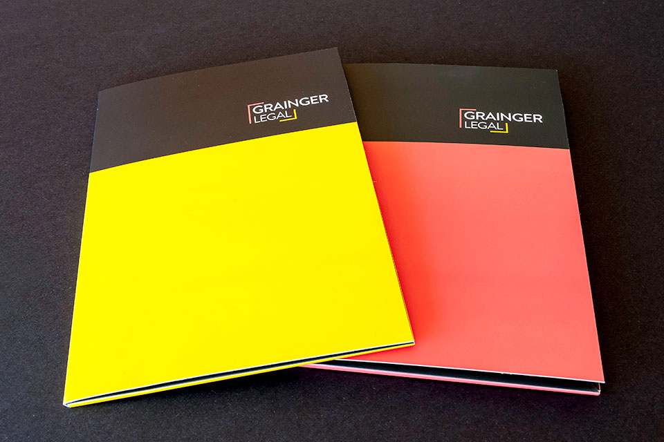
The logo developed represents the full end-to-end legal service provided to their clients. The coloured end graphics represent an inclusive approach between the firm and it’s clients. The ‘bracket’ like elements also represent teamwork. The word Grainger breaks from within the shape evokes the notion that the firm go above and beyond the standard to achieve positive and enriching results for clients.
Our client was thrilled with our work, and a testimonial from one of the partners is below:
From the first minute we met Megan it was clear that she was interested in finding out who we were and what our business offered. She listened to everything we had to say and came back to us with some wonderful concepts – it made it very difficult to choose between them! Since then we have had countless compliments about the great look of our logo, website and stationery. Everyone at Brown Ink was efficient, professional and very pleasant to deal with. We would not hesitate to use them again and look forward to a continuing professional relationship.
Caroline Grainger, Principal Lawyer, Grainger Legal
PROJECT INCLUDED
- Logo Design
- Presentation Folders
- Business Cards
- Letterheads
- With Comps
- B4 Envelopes
- DL Envelopes
- Website


