Which industry has the worst logos? Part II
Time to explore the transport industry!
Logo design in today’s world is completely under rated. People do not understand how important a good logo is and how valuable it is to their business. It not only provides an easy to recognise identity for your business, but also communicates who you are and what you stand for.
Some logos are incredibly clever and effective, while others are poorly made and fail to communicate what the brand is trying to achieve. A logo should be simple, not loud and most important of all, it must be easily recognised. Perhaps the best logo is the one where it has the ability to capture a person’s emotion.
Rodney has laid down the gauntlet with some pretty impressive examples of poor logo designs in the radio industry but I’m confident I have got him covered with the Transport Industry.
Trucks are prime advertising and marketing space, after all they are a moving billboard. With so many transport companies out there, why are they missing this opportunity to make their mark and stand out from the rest?
Without further ado, here’s my worst logo designs of the transport industry.
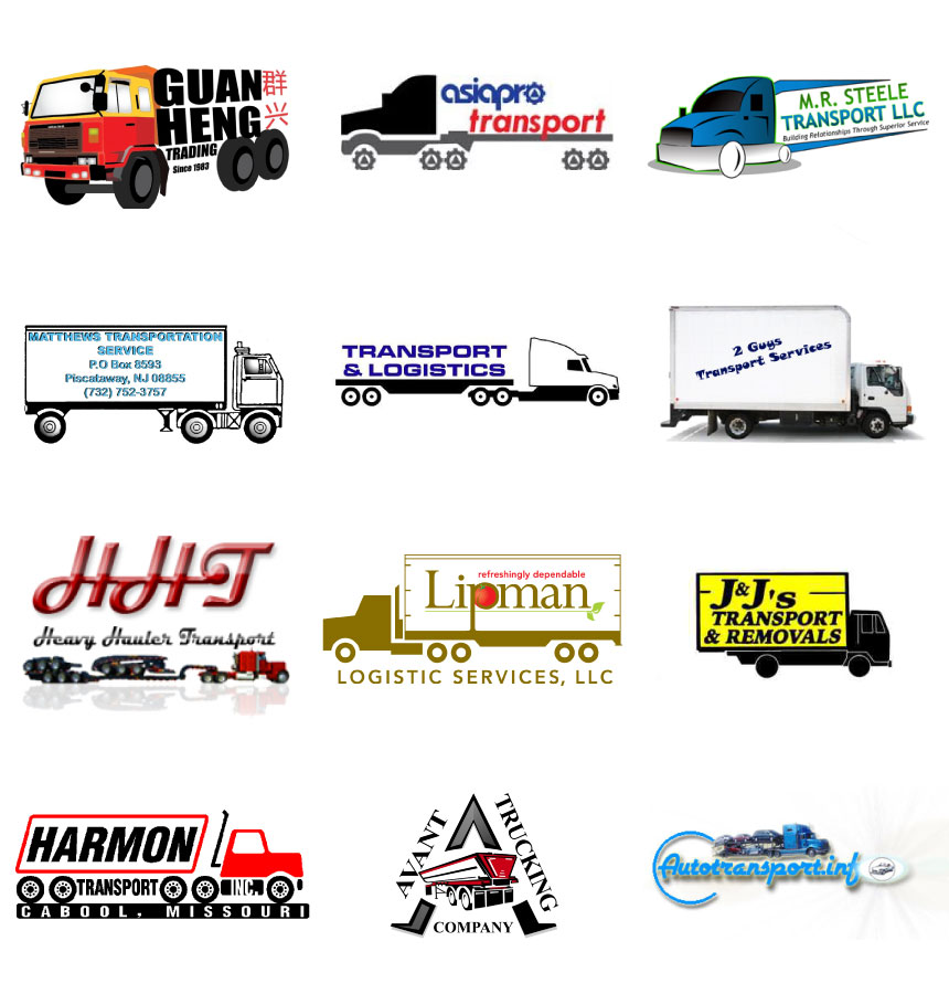
MY NEPHEW IS A DESIGNER!

No…he is not a designer…
It’s amazing what you can do with a bit of clip-art and Microsoft Word, but never let this be your companies first impression.
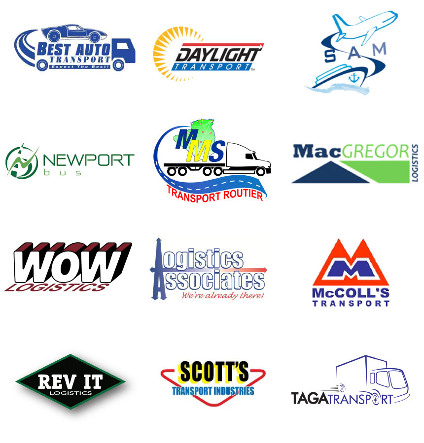
NIKE HAS A SWOOSH RIGHT?

Try again!
If it doesn’t have a truck in it they put a swoosh or globe or both. Nike’s trademark tick of approval and the swoosh’s used in these designs are a completely different ball game.
No, you are not Nike – just don’t do it.
THE COMEDY CHANNEL

Try not to laugh
These impeccable works of art are enough to make any designer cringe.
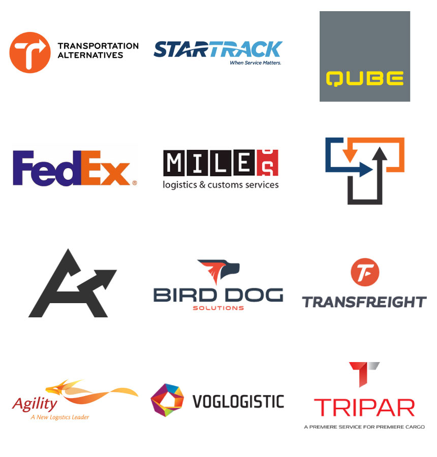
SO WHO HAS ACHIEVED LOGO GREATNESS?

As expected, I spent more time finding good logos to fill this section than all the others put together. These are the standout companies that have managed to break the mould of transport industry logos and should be commended for this.
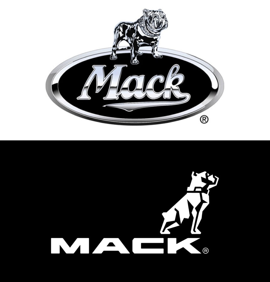
Hopefully the future brings more transport companies taking the leap into the bold new world of logo design and development. In early 2014 Mack Trucks took that leap with its first major update to its logo since 1932, breaking away from the traditional chrome badge that trends the truck manufacturing industry.

Are there any other industries you can think of that need to modernise their logos?
Or perhaps you would like to refresh your own logo?


