
AEROVISION PROJECT DESCRIPTION
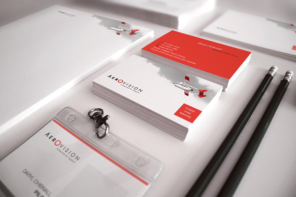
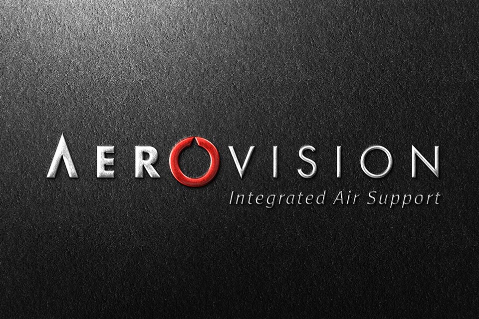
Aerovision had been in business for 15 years when the owner decided his brand identity needed an update. There were elements within the old visual identity which were looking dated, but other elements which had aged very well. We kept the best bits like the aeroplanes and colours and made some minor changes to the logo. The typography in the logo stayed the same, but the icon which had been separate from the typography, was simplified and then incorporated into the typography.
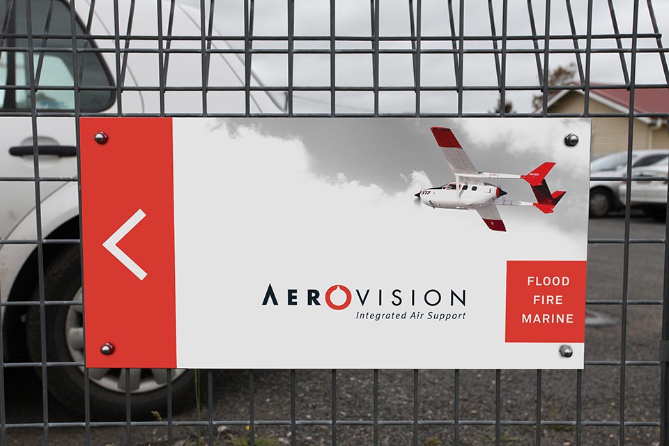
There were other updates to the stationery with different planes being added to the secondary graphics. This brand identity is unique because it beats to its own drum, when compared to the identities of its competitors who all feel the need to look the same.
PROJECT INCLUDED
- Logo
- Business Card
- Stationery
- Building Signage
- Folder Covers/Spines
- Logo Style Guide


