
BAKC TO BASICS PROJECT DESCRIPTION
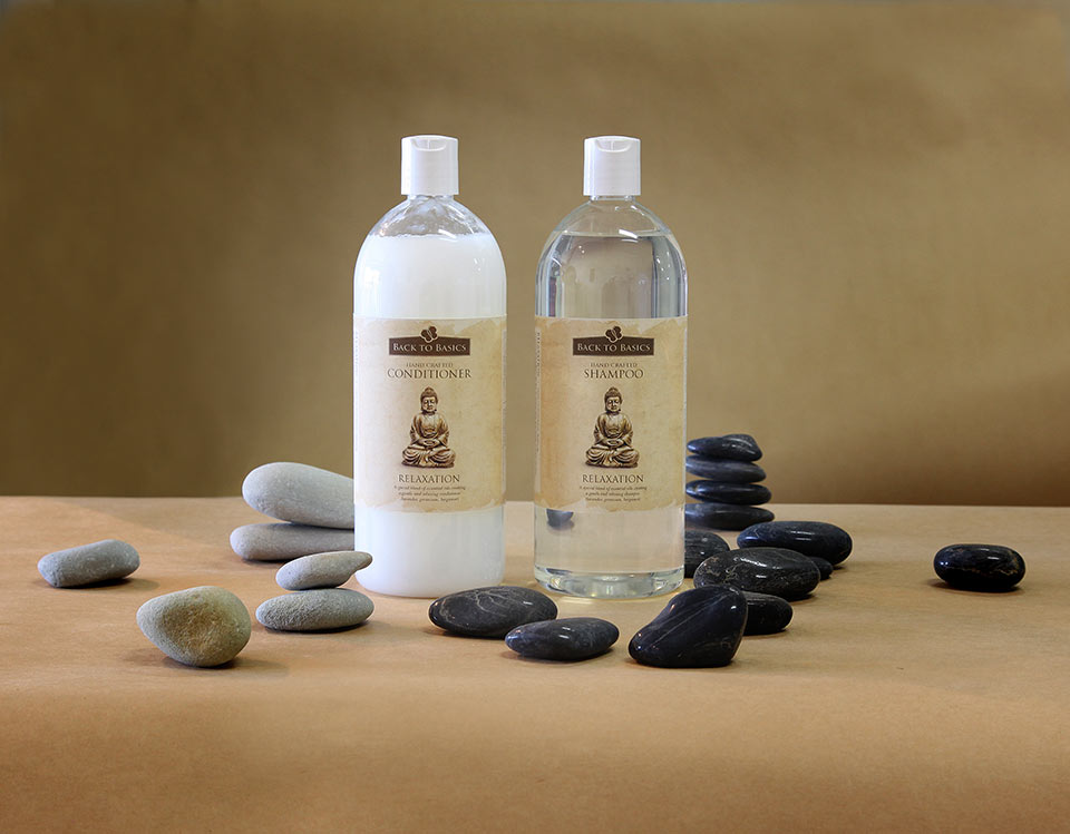
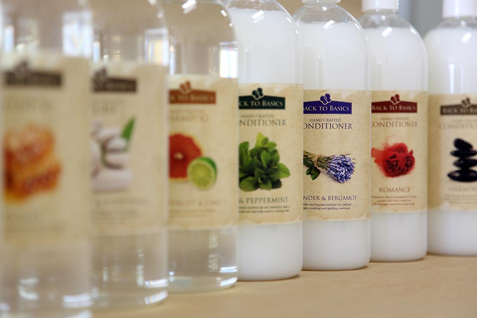
Back to Basics has been around for over twenty years and recently they sold off the wholesale component of the business. This major decision became the driving force to rebrand their current range in order to differentiate it from the wholesale range. The opportunity to revisit the original objectives of their 20 year old product, showed that it had lost its way and moved into a visual area where it no longer represented what “Back to Basics” meant.
In our first meeting Yvonne and Phil the owners of Back to Basics, explained in great detail where they believed the product went wrong. At the end of the meeting we showed them some product packaging that we felt was more in keeping with the “Back to Basics” philosophy. This spawned a hive of enthusiasm which allowed Brown Ink Design to create what you see on this site. When we presented these ideas, Yvonne was especially delighted, and given that she gave birth to these products over twenty years ago, our first hurdle was cleared with great distinction.
I have to say this project was an extremely enjoyable experience, it’s always a bonus when a client provides you with guidelines and lets you do your job with the utmost trust for your knowledge and experience.
MATERIALS & PRINTING INFO
- Labels. 4 colour process matt laminate
- Stock. Self adhesive coated
- Package. Box board
- Colour. 4 colour process


