
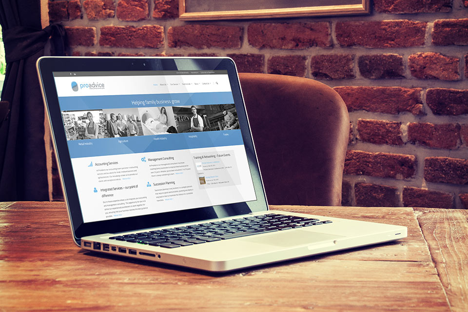
PROADVICE PROJECT DESCRIPTION
ProAdvice is a unique business, they help others help themselves. They are trusted advisers supporting family businesses to make holistic decisions regarding people, profit and environment. The aim of their new logo is to capture the very essence of their mission.
The Icon
A multifaceted shape representing a number of important values.
- Talking bubbles, most commonly seen in comic books, have a practical use and are always used to represent conversations. In the icon they represent two people having a conversation.
- The blue component is a stylised shape of the letter “p”, the bottom shape is more obscure by representing the letter “a”.
- The upper section of the icon represents the sky, the lower the land. Where they overlap creates a darker section which resembles a river. The feel of flowing hills is synonymous with regional landscapes. Regional communities are ProAdvice’s core market.
The Typography
ProAdvice is an innovative company, by using all lowercase we are breaking with traditional grammar and punctuation, in effect bucking the conventional thinking.
The Colours
Choosing a bright colour and a neutral colour, offers great flexibility with our visual communications. The two colours compliment each other beautifully, they are not masculine, nor are they feminine. They represent professionalism without a harsh corporate edge.
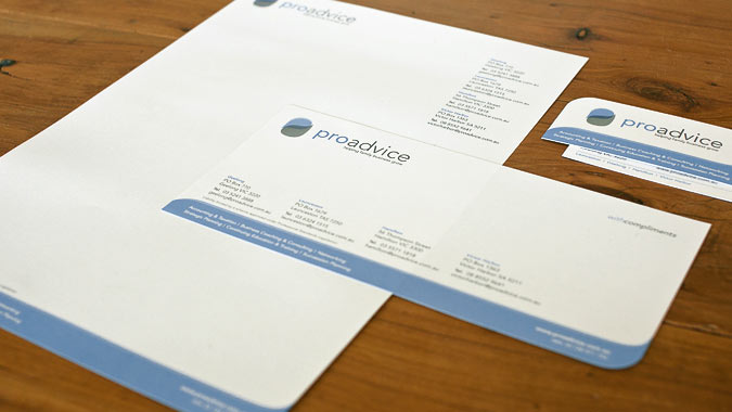
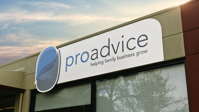
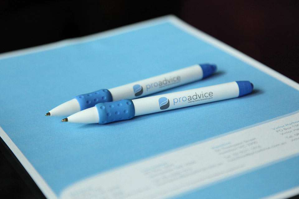
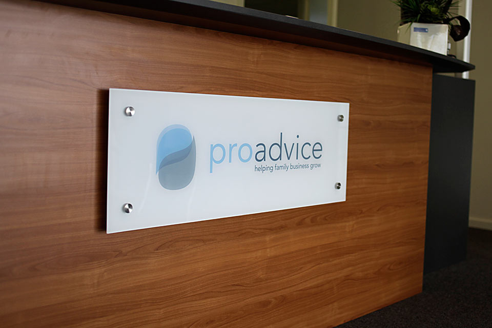
PROJECT INCLUDED
- Logo
- Stationery
- Presentation Folder
- Pull-up Banners
- Site Signage
- Email Signature
- Photography


