Case Study Projects
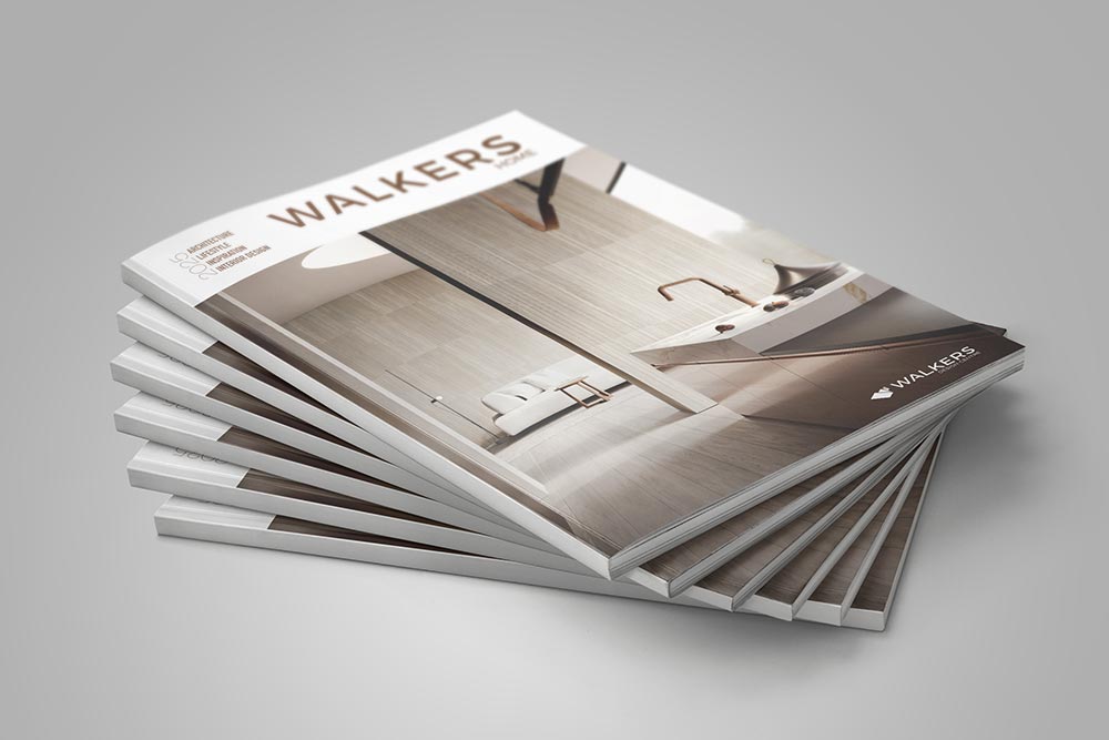
Case Study :: Walkers
An institution in Geelong for over 100 years, a rebrand of such an old business steeped in history cannot be taken lightly.
BEFORE
AFTER
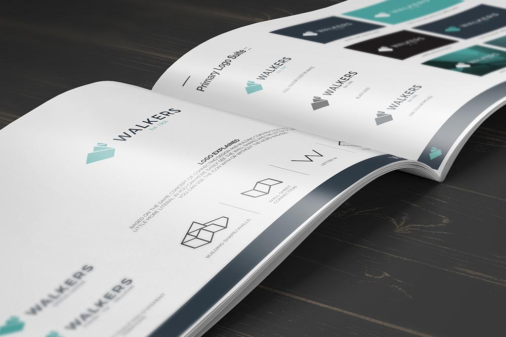
THE CHALLENGE
Established in 1906 Walkers has been a part of the Geelong landscape for a very long time. Like many businesses it has evolved over these years, in more recent times the business has expanded its range of products into the bath-ware sector. It was felt by the owners, the current logo didn’t reflect the style and quality of products they now sold, they were right.
THE SOLUTION
The largest hurdle Brown Ink Design faced with this project was not designing the logo but getting the extended Walker family of owners to agree on a direction. When you have a family with a strong emotional connection to their business, then it can make it more difficult for them to find common ground on how they want their business to look and be perceived by the public.
Brown Ink Design have a tested and proven design process, we set the marketing objectives based on answers given by the client to questions provided. We then follow up with an open discussion, marrying up client suggestions with design styles. Once these marketing objectives have been set if we stray from the course we use them to bring design process back on track. We did have a number of occasions where we needed to return to the agreed marketing objectives, in order to move forward.
One large issue we saw with the old branding was the shade of green used. This is not a particular stylish colour, in fact it is a polarising colour. We wanted a colour which was less polarising and more complementary.
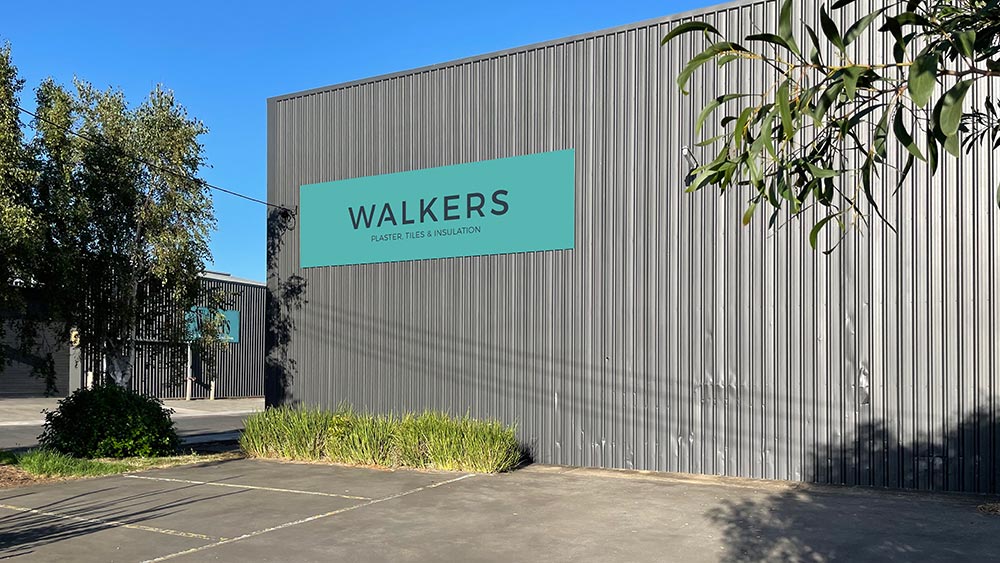
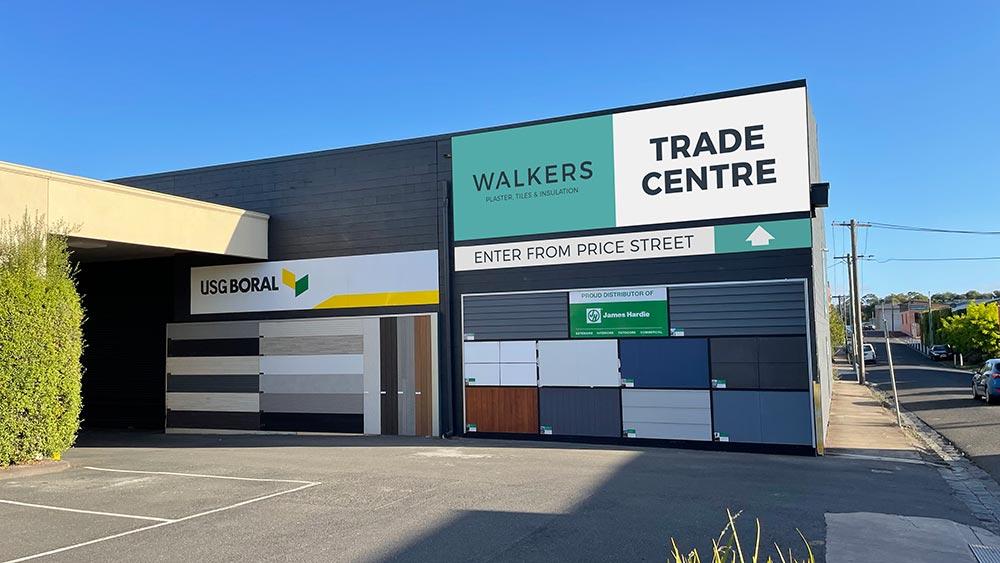
THE OUTCOME
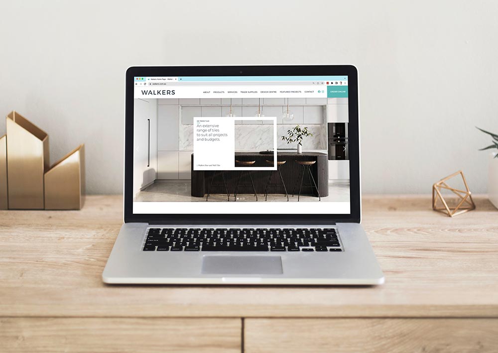
While the entire branding process took longer than expected the outcome is one both Walkers and Brown Ink Design can be very proud of. The design and construction of the new Walkers website was a large turning point for the brand. The clean design married with stylish photos allowed the owners to see the full potential of their new brand.
Ultimately when you sell style, you don’t want your customers to question your ability to be stylish when they look at your branding and marketing.


