Richmond Football Club Launches New Logo
I must declare my allegiance up front, I am a passionate tigers supported and have been since I spoke my first words, I think they were something like “mum, carn the tiges”. I find myself some 38 years later instilling the same passion into my children. After seeing the tigers have a stirring win over the swans at the MCG this year, Cooper my 5 year old son, sat through all 10 renditions of the tigers theme song with a grin from ear to ear singing at the top of his lungs. My mission it would seem was complete, one more passionate tigers supporter added to the fold.
So it was with keen anticipation I watched a video explaining why it was necessary for the Richmond Football Club to revamp it’s logo and vision. I like the new logo, I think it is a vast improvement and I believe it does represent a “proud” club. It does provide a more professional visual representation of my club, the tigers word has been dropped I guess to give a more corporate professional separation from just being a sporting club. The addition of the EST 1885 is essential, because tradition in any club is important. Speak to any newly formed club and the one ingredient their brand misses is tradition. The marketing departments of these clubs spend many hours, weeks, months and years developing a culture, which becomes ingrained as their tradition. This is what I believe the new logo is all about, it marks the starting point for the future of the club, because of course tradition can include both negative and positive attributes. The more recent past (20 years) of the tigers is not what we would refer to as successful. I believe the club is keen to create a belief the past is the past, lets not forget it but the future looks bright tigerland.
Congratulations to the club for making this change, these types of changes are not easy and design by committee is not for the faint hearted. I’ve seen many similar branding projects turn out to be a complete waste of time and money because the end product was compromised in trying to achieve too much.
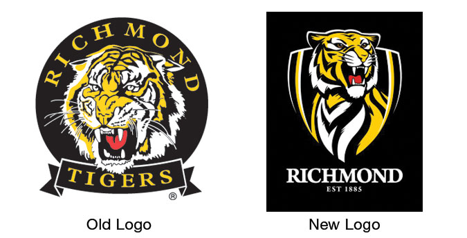
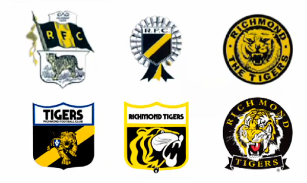
While watching the video I took a keen interest in listening to Canyon Design Group description of what the objectives and vision for the club are. There was one point made that I didn’t quite understand given the chosen logo. Quentin Brown from Canyon Design Group said ” Richmond were clear that they wanted to position the new brand away from the more stylised club approaches in the AFL and into a new territory closer to the more realistic traditional brands”. Given the chosen logo I would say the illustrative style was more stylised than realistic. Here are a selection of logos the Richmond Football Club have used of the journey. Other than the two in the middle (top and bottom), the consistent theme has been a more illustrative tiger.
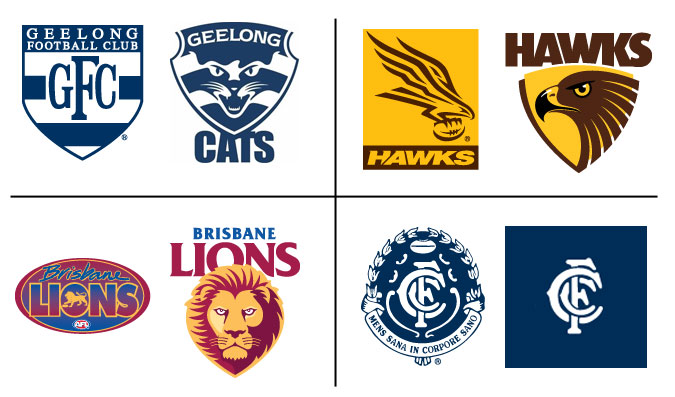
I believe with logo design less is more (their are few exceptions), if you can convey an emotion or story with less then you should do it. A more simple logo becomes easier to reproduce across many mediums. My favourite logos in the AFL are mostly the versions Quentin had grouped as stylised. These include the logos shown below, in general I see myself as a traditionalist and truly love “old world design”, as a style and message it has a place.
Here are a few other logos from AFL clubs that have been redesigned in the last few years.


