
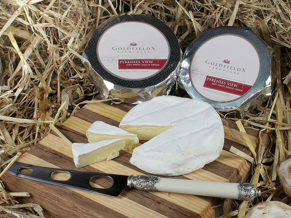
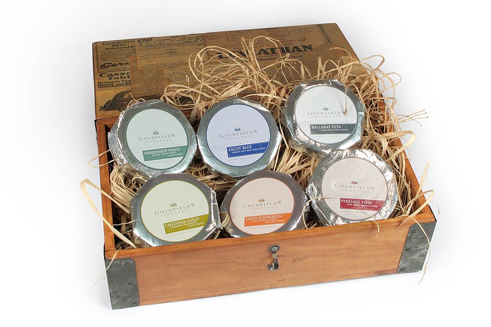
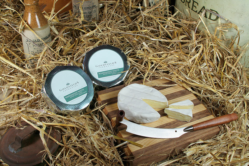
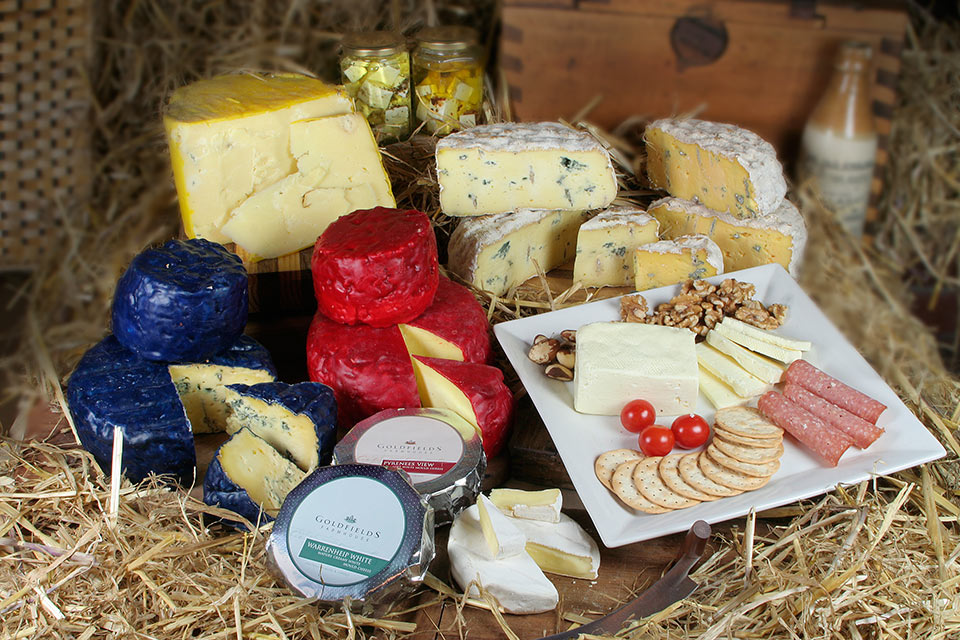
GOLDFIELDS FARMHOUSE PROJECT DESCRIPTION
Goldfields Farmhouse wanted a contemporary look without dismissing their traditional roots. The labels were their main communication tool when it came to expressing the quality of their product. With nine cheese varieties, the choice of colour for each variety became a balancing act. The end result was pleasing and all design objectives were met and surpassed.
MATERIALS & PRINTING INFO
- Colour. 4 colour process
- Stock. Self adhesive
- Diecut to shape


