Can you make my logo bigger?
A simple request you may think, but one which can have far reaching ramifications to the overall design. In this blog we discuss why making your logo bigger doesn’t always work?
Before we can properly answer this question it is important to understand what drives this question. We can guarantee the reason a client asks “can you make my logo bigger?” is because they want their business to stand out more. This is not unreasonable, every business owner wants their business to stand out and grab your attention.
But does making the logo bigger help your business stand out more? We can categorically say NO, it doesn’t. To help explain, we will provide examples of designs from print advertising, business cards, signage and outdoor advertising that explain what makes these designs work and why making the logo bigger doesn’t help.
When clients generally refer to their brand they are talking about their logo. While this is not incorrect their brand is much more than their logo. A company’s visual brand can utilise many more elements that add to the overall visual communication. These will include, photography, a dedicated colour suite, dedicated font families, secondary graphic styles (pattern, images) and a set combination on how these elements work together.
Your visual brand is the grand sum of all of these elements used together. This in turn provides a better way to tell your story (marketing), because lets be honest your logo will only tell part of your story. It is a common misconception with business owners that their logo is their brand. This is easily fixed by using the example of driving down a busy street looking for your bank, are you looking for the name of the bank? or are you looking for the colours of your bank? Almost universally they answer, I’m looking for the colours of my bank. At this point a light bulb moments happens and they realise how important their secondary graphics are.
While it would be silly to say making a logo bigger for every design is wrong, each design and project objectives should be analysed on their merit.
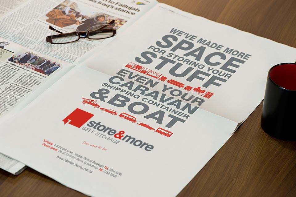
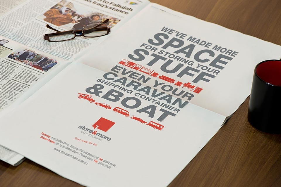
Newspaper advertising is a difficult medium to grab the readers attention. A full page advert helps because it has less to compete with as apposed to a quarter page advert.
With this Store & More advert, if we enlarged the logo to match the width of the text, the logo blends visually with the main section of the advert. But by leaving the logo smaller and surrounding it with some white space it separates from the main message and stands out more. We call this creating hierarchy with the design, we want the viewer to read from top to bottom, they are not attracted to the advert because of the logo. They are attracted to advert because of the message and how it is presented.
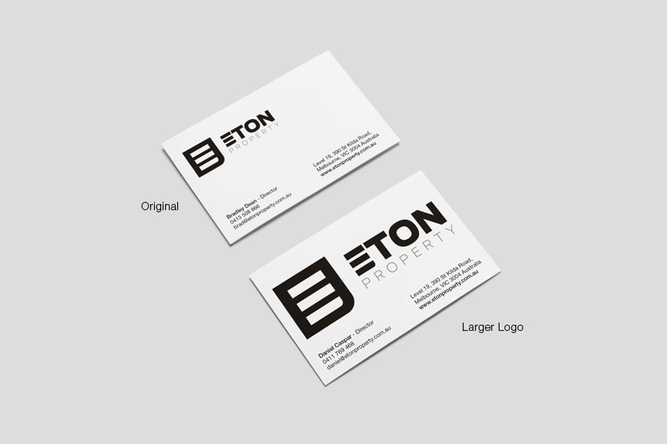
Business Cards are a common medium where we are asked to make a logo bigger, the Eton Property business cards are a great example of why we opt not to do so.
Eton Property are a high-end property sales agency in Melbourne, their brand philosophy is based on offering a premium product with premium service. Our design (Original) features the Eton Property logo at a size which is prominent, without being dominant. Again utilising negative space around the logo to create a clear hierarchy within the design.
If we were to enlarge the logo as shown, although it is certainly prominent, it ruins the premium and contemporary design of the card. Remember, sometimes less is more and a business card is not a poster.
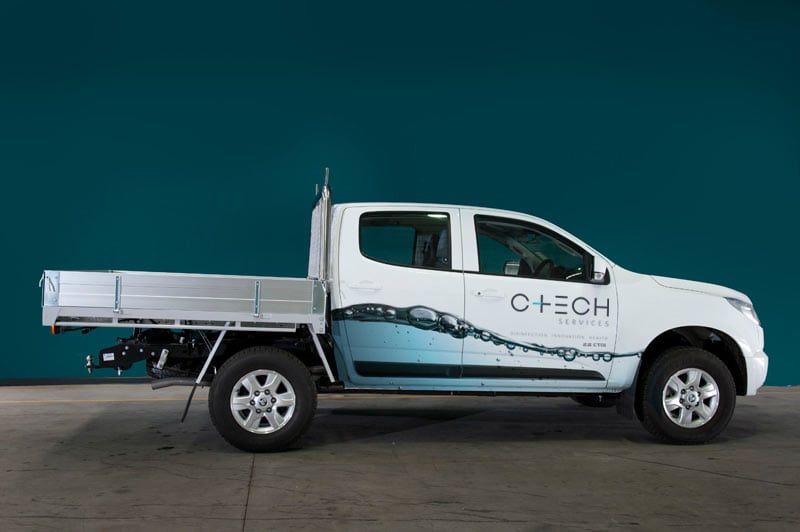
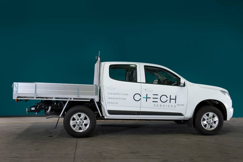
Remember when I spoke about secondary graphics earlier in the article, this signage is a great example of its importance. When we designed the branding for C-Tech Services our design process discovered the business’s greatest attribute was their ability to keep millions of people’s water clean, pure and healthy. The use of the water image significantly improves the communication of what this business does. The image also appears on the business card, letterhead and presentation folder, view the C-Tech rebranding project.
The design on the left is our final design, in this design the logo plays a supporting but still important role. The design on the right has a larger logo but fails to grab your attention in the same way, without the water image the communication is also less clear about what C-Tech does.
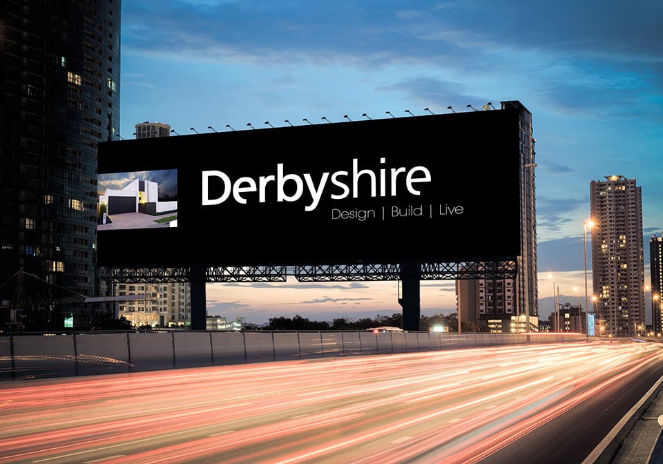
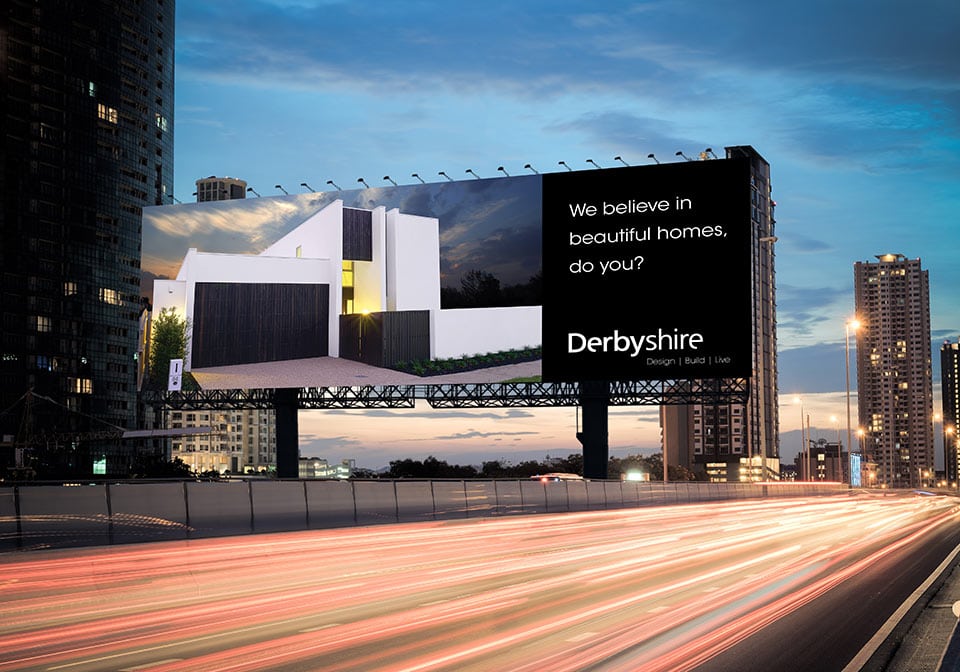
This example is a tricky one, every design or marketing project needs to be asked this question. “What are we trying to achieve with this piece of marketing?”. You could argue the billboard with the larger logo will be easier to see, and you would be correct. But what does the logo tell you about the business? Does it make you want to go to their website? Do you even know what they do by seeing just the logo?
The answers to these questions will impact on the design and the content of this billboard. If the business is a well known brand because they have been around a long time and have marketed themselves consistently for years then it could be feasible that people will know what the company does. The billboard would then fall into the “brand awareness” advertising category.
If the business hasn’t been marketing for years and people need to know more about what you do then the version with the larger house and statement will give them a much better idea and insight into the business.


