Case Study Projects


THE CHALLENGE
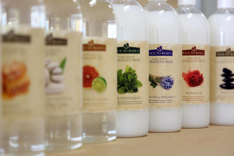
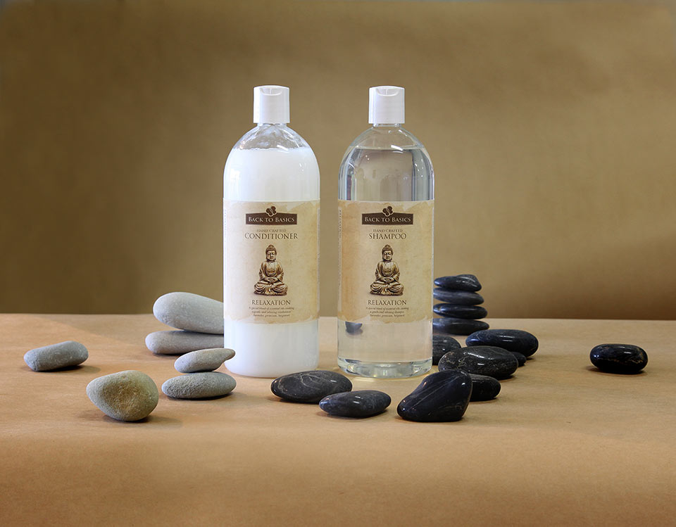
Back to Basics packaging had lost its way. Their philosophy was about getting back to nature’s true gifts and keeping the process as natural as possible. Their old packaging did not convey any visual link with this philosophy. Glossy and brightly coloured, the labels had no clear hierarchy and were a mixture of conflicting messages.
THE SOLUTION
Back to Basics point of difference is their strong link with nature. They have kept the products pure and void of any chemical manipulation. Many other products propose this link, but don’t fully embrace it, in essence “talk the talk” but don’t “walk the walk”, Back to Basics does. While we would have preferred to dispense with the plastic bottles, this was not a viable option from a cost point of view.
THE OUTCOME
Brown Ink Design is in the business of creating perceptions. With Back to Basics the authenticity was real, which made the process more enjoyable and straight forward. The resulting rebrand has helped the Back to Basics brand become more memorable, because there is now a consistency with the labels.


