Case Study Projects
Case Study :: Cafe Meal Branding
When your product is aimed at a teenage market, you need to remain relevant in their eyes, this was one of the objectives for this project.
BEFORE
AFTER
THE CHALLENGE
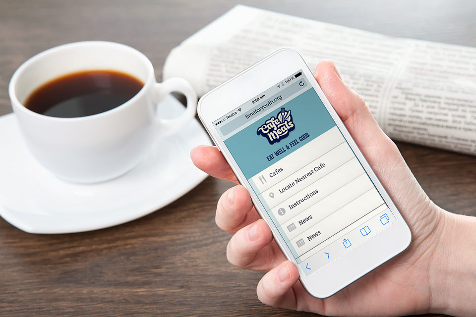
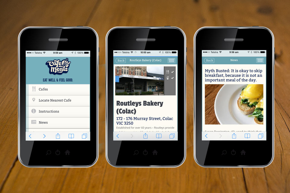
Time for Youth is a “not for profit” agency that aims to minimise homelessness & create opportunities with young people & families in the Geelong region. Brown Ink Design was brought on board to rebrand their “Café Meals Club” Project.
THE SOLUTION
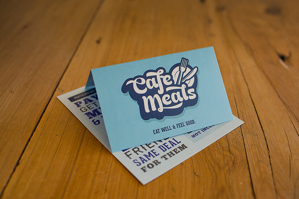
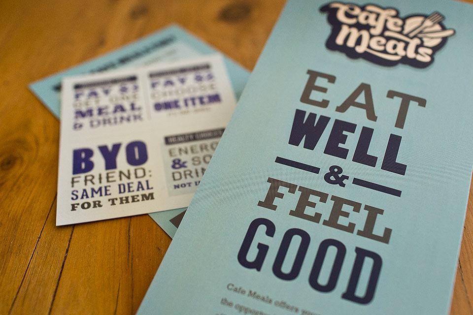
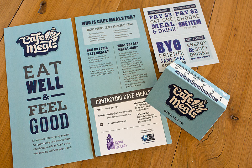
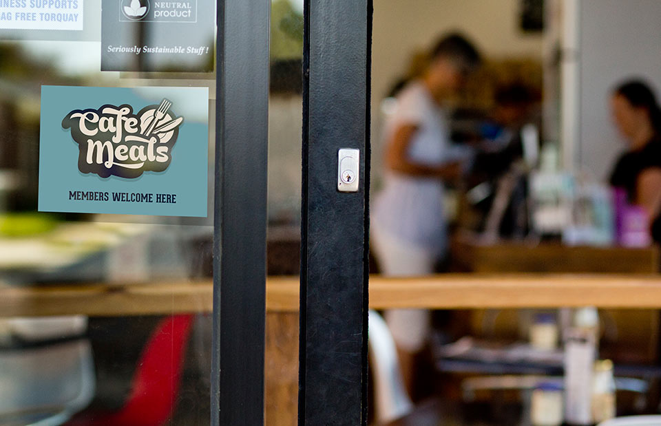
Café Meals offers young people without consistent living arrangements, or limited access to food, the opportunity to access healthy meals for $3. A logo, Membership card, DL Brochure and sticker to identify participating cafes were developed, and they have received great feedback from the young people & participating cafes.
THE OUTCOME
Given Cafe Meals was aimed at young adults it was important to us they felt Cafe Meals was there for them, they needed to be able to relate to it. We didn’t want an organisation that looked like it was designed by adults trying to be something appealing to teenagers and fail miserably.
The feedback Time for Youth received from the members of the Cafe Meals program was positive and worthwhile. We believe we succeeded because we engaged the members early in the creative process and involved them through the whole design process.


